 Colour Cozy
Make a picture pop with one accent color
A calm page with one small, bright surprise is often more striking than a page full of loud colors. Here is how to choose that surprise and where to put it.
In this guide
To make a picture pop with one accent color, color most of the page in a calm, related set of colors, then choose one bright color that stands apart from them and use it on only a few small shapes near the main subject. The accent works because it is rare: the less of it there is, the more the eye goes straight to it. A color from the opposite side of the color wheel makes the strongest accent.
Have you ever finished a coloring page and felt it was nice but a bit flat? Often the fix is not more colors. It is fewer, plus one small, bright surprise.
That surprise is called an accent color. Designers use it on posters and websites, and home decorators use it on cushions. It works just as well on a coloring page, whether you use pencils, markers or an app. This guide shows you how to pick one, where to place it, and how much is enough.
What an accent color does
An accent color is a color that appears only a little, and stands out because the rest of the page is quieter. Think of a red ladybird on a green leaf, or a yellow window glowing in a blue night scene. Your eye lands there first.
A page usually has three kinds of color:
- The main color. It covers the biggest areas, like a sky or a background circle.
- The helper colors. They fill the middle-sized shapes and sit close to the main color, so the page feels calm.
- The accent. One bright color, used on a few small shapes.
The accent only works because it is rare. If you use it everywhere, it stops being a surprise and becomes just another main color. That is the whole trick, and it is why a page with one accent often looks more finished than a page using every pencil in the box.
How to choose your accent color
The strongest accent is a color that is very different from the rest of the page. There are three easy ways to find one.
- Look across the color wheel. If your page is mostly blue, a touch of orange will glow. If it is mostly green, try red or pink. Our guide to complementary colors explains these opposite pairs in plain words.
- Switch temperature. If your page is mostly cool (blues, greens, purples), pick a warm accent like coral or yellow. If it is mostly warm, pick a cool one like turquoise. The warm and cool colors guide has more on this.
- Switch brightness. On a soft pastel page, a single strong, saturated color stands out even if it is a close neighbour on the wheel. On a dark page, a light or glowing color does the same job.
You only need one of these to be true. If two are true at once, for example a warm, bright coral on a cool, soft blue page, the accent will be very strong, so use even less of it.
Where to put it: five calm steps
Here is a simple routine you can follow on any picture.
- Find the main subject. Ask yourself what the picture is about: the cat, the rocket, the cake. That is where you want eyes to land.
- Color the big areas first, in a calm set. Pick a main color and two or three helpers that sit close together on the wheel or share the same softness. Leave the small details blank for now.
- Pick two or three small shapes for the accent. Good choices are a bow, a cheek, a flower, a button, a star, or a stripe on the subject. Keep them on or near the main subject.
- Color those shapes with your accent. Stop there, even if it is tempting to add more.
- Step back and squint. Hold the page at arm's length or zoom out. Does your eye go to the accent first? If yes, you are done. If not, see the fixes below.
A good rule of thumb is that the accent should cover a small part of the page, much less than the helper colors.
How much accent is too much?
It is easy to love your accent so much that it creeps everywhere. Watch for these signs:
- Your eye jumps around. If several areas compete for attention, remove the accent from the ones furthest from the subject.
- The accent touches the edges of large shapes. Big areas of a strong color behave like a main color. Keep the accent to small pieces.
- Two different accents fight. If you added both a hot pink and a lime green as "the special color", pick one and recolor the other in a helper shade.
If you are coloring on paper and went too far, you can often rescue it by darkening the background a little, so the accent areas feel smaller by comparison. On a screen it is usually easier: just recolor the extra shapes in a helper shade.
Accent color ideas to try
These pairs are simple starting points. The first color is the calm page, the second is the accent.
- Soft blue sky, coral heart. Warm against cool, easy and friendly.
- Pastel lilac page, sunny yellow star. Yellow and purple are opposites, so even a tiny star glows.
- Forest greens, a red mushroom cap. A classic storybook look.
- Warm sunset oranges, a turquoise detail. Great for a beach or sunset scene. Our sunset coloring ideas has more palettes for warm pages.
- Deep night blues, one neon glow. A single bright shape on a dark page. The neon color palette tips cover how to make that glow work.
Trying it in Colour Cozy
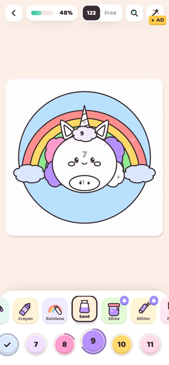
Colour Cozy, our calm ASMR coloring game for Android, is a good place to practise this, because you can switch between color by number and free coloring. Trace the picture first, then tap the Free side of the switch at the top of the screen to choose your own colors.
A few things in the game suit the accent idea:
- Special tools for the accent only. Glitter, neon and puffy paint are pro tools with their own look. Saving one of them for two or three small shapes makes them feel special instead of busy. Our tools guide explains each of the 12 tools.
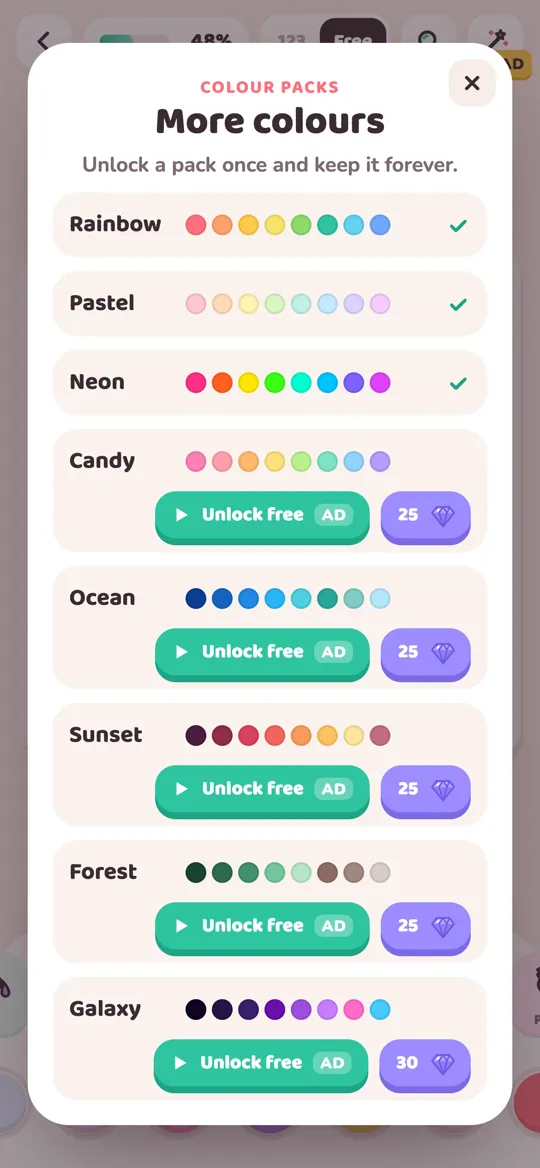
- Colour packs as calm sets. Packs like Pastel, Ocean and Forest give you a ready family of helper colors. Pick your accent from a different pack to make it stand out.
- Pinch zoom for small shapes. Accents usually live in small details, and pinch zoom makes them easier to fill neatly.
- Watch it back. When you finish, the picture comes alive and plays a timelapse, which is a nice moment to see whether your accent catches the eye.
Quick recap
A page pops when most of it is calm and one small part is not. Choose a main color and a few helpers that belong together, then pick one accent that is opposite, warmer or cooler, or much brighter. Put it on two or three small shapes near the subject, step back, and stop while it still feels like a surprise. Next, try the limited palette challenge.
FAQ
What is an accent color on a coloring page?
It is a color you use only on a few small shapes so it stands out against a calmer page. Because it is rare, the eye goes to it first, which makes the picture feel finished and focused.
How do I pick a good accent color?
Pick a color that is clearly different from the rest of the page: the opposite on the color wheel, the other temperature (warm versus cool), or much brighter than the soft colors around it. One of these differences is enough.
Can I use more than one accent color?
You can, but one is easier and usually looks calmer. Two strong accents tend to compete for attention. If you want a second one, make it a softer version of the first or use it on a single tiny shape.
Where should the accent go?
Put it on or near the main subject, on small details like cheeks, a bow, a flower or a star. A single extra touch on the far side of the page can help the eye travel across the picture.
What if my page still looks flat?
Check that the big areas are calm and related, then make sure the accent is clearly brighter, warmer or cooler than them. Darkening the background a little can also make a small accent look stronger.