 Colour Cozy
How to choose colors that go together, five easy ways
Stuck staring at a full box of colors? These five simple methods give you a matching set in a minute, for paper or an app.

In this guide
To choose colors that go together, start from something that already works: a real object, a few neighbors on the color wheel, one color in light and dark shades, or a ready-made palette. Pick three to five colors, test them side by side on a scrap, then use most of one color, less of the second and only a little of the brightest one.
A big box of colors is exciting for about ten seconds. Then you have to decide what goes where, and the picture you imagined starts to look like a pile of crayons.
The good news is that you do not have to invent a color scheme from nothing. There are a few simple ways to borrow one, and each takes about a minute. This guide walks through five of them, shows how to test a set before you commit, and ends with quick fixes for when something looks off.
If you want the ideas behind why these methods work, our color theory basics for coloring pages explains the color wheel, light and dark, and warm and cool in plain words. This article is the hands-on side: what to actually pick up first.
Why some colors look right side by side
Colors seem to match when they share something. They might sit close together on the color wheel, be equally soft or equally bright, or all lean warm or all lean cool. When colors share nothing at all, the eye jumps around and the picture feels noisy.
That is why the easiest matching sets are built around one shared thread. Every method below gives you that thread in a different way. You can still add a surprise color on top, but it works best when the rest of the page agrees with itself.
Five easy ways to find matching colors
1. Borrow from something real
Look around you. A bowl of fruit, a favorite sweater, a sunset photo or a box of tea all hold color combinations that already feel natural. Pick three or four colors you can see in that one thing and use them on your page.
This works because real objects come with built-in harmony. A peach has soft orange, pale yellow and a blush of pink. Those three will sit happily on almost any cute picture.
2. Use neighbors on the color wheel
Choose one color you love, then take the colors right next to it on the wheel. Blue with teal and green. Red with orange and pink. Yellow with gold and light green. Neighbors share a lot, so they blend into a calm, friendly group.
To stop a neighbor set from feeling flat, add one small contrast from the other side of the wheel, like a single orange detail in a blue and green picture.
3. One color in many shades
Pick just one color and use it from very light to very dark. A pale pink background, a medium pink body and a deep raspberry outline area can look surprisingly rich. Add white or a soft gray as a rest color.
This is the safest method of all, because nothing can clash. It is also a fun challenge when you feel stuck.
4. Start from a ready-made palette
Palettes made by someone else are a shortcut, and there is no shame in using them. Paper coloring sets often come grouped by theme, and many coloring apps offer packs of colors that were chosen to sit together.
Our pastel color palettes give six combinations you can copy straight onto a page.
5. Let the picture choose
Sometimes the subject decides for you. A whale wants blues and a pale belly. A strawberry cake wants pinks, cream and red. Start with the obvious colors for the main thing, then pick the background from the neighbors of those colors.
A five-step swatch test before you start
Matching colors are easier to judge next to each other than in your head. Before you color the whole page, try this:
- Pick three to five colors using any method above.
- Make small swatches. Color little patches side by side on a scrap of paper, or along the edge of the page where it will not show.
- Put the biggest color in the middle. Whatever will cover the most space should be the patch the others touch.
- Squint at it. Half-close your eyes. If one patch jumps out much more than the rest, decide if that is your star color or a color to swap.
- Swap one, not all. If the set feels off, change only the color that bothers you most, then look again.
The whole test takes a couple of minutes and saves a lot of erasing later.
How much of each color to use
Picking the colors is half the job. The other half is deciding how much of each one goes on the page. A simple rule of thumb that designers use:
- Most of the page in your calmest color, often the background or the biggest shape.
- A smaller amount of a second color for the main character or object.
- Just a little of your brightest color for small details like cheeks, a bow or a star.
The finished dumpling picture below follows this almost exactly. A big soft yellow circle covers most of the space, warm peach and gold fill the dumplings and basket, and small pink hearts and blue clouds add the accents.

If you use equal amounts of every color, nothing leads. Letting one color win makes the others look like they belong to it.
Matching colors in Colour Cozy
In Colour Cozy, colour by number gives you a set of colours for each picture, so the matching is done for you. When you switch to free mode, you choose your own colours, and that is where these methods help.
Free mode starts with the Rainbow colours. You can also unlock colour packs, each one a set of 10 colours built around one theme: Pastel, Neon, Candy, Ocean, Sunset, Forest and Galaxy. Each pack is a ready-made answer to "what goes with what". Forest, for example, runs from deep green to pale mint, adds a few soft browns and finishes with a warm yellow and an orange, which is method 2 and a small contrast in one row.
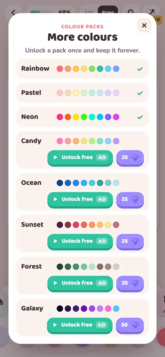
You unlock a pack once and keep it. Our guide on how to unlock colour packs explains the options step by step.
Quick fixes when colors clash
Even with a plan, a picture can look wrong halfway through. Try these before starting over:
- Too busy? Replace one bright color with a softer version of itself.
- Too flat? Make one area much darker, or add one small spot of a color from across the wheel.
- Two shapes blur together? Make one of them lighter so they separate.
- Background fighting the character? Switch the background to a pale neighbor of the character's main color.
- Still unsure? Add white or a light gray somewhere. Neutral space gives the colors room to breathe.
FAQ
What are three colors that always go together?
There is no set that works for every picture, but a soft neutral like cream, one main color and a lighter or darker shade of that same color is very hard to get wrong.
How many colors should I use on one coloring page?
Three to five main colors is a comfortable range for most pages. You can add a neutral like white or gray on top without making the picture feel busy.
Do I need to learn color theory to pick matching colors?
No. Borrowing colors from a real object, using one color in several shades or starting from a ready-made palette all work without any theory at all.
Can kids use these methods too?
Yes. The "one color in many shades" and "borrow from something real" methods are especially easy for children, and the swatch test is a fun warm-up.
Can I choose my own colors in Colour Cozy?
Yes. In free mode you pick colours yourself from Rainbow or any colour pack you have unlocked. Colour by number gives each picture its own set of colours.