 Colour Cozy
The limited palette challenge: one page, three colors
Fewer colors, more ideas. Here is how to pick a tiny set, stretch it across a whole picture and still end up with something you love.
In this guide
A limited palette challenge means coloring a whole page with only a few colors, usually three to five. Pick one main color, one partner and one small accent, then get extra shades by pressing lighter or harder, layering, or using gradients and textures. The result almost always looks calm and planned, because every color already belongs together.
Most of us reach for every pencil in the box. Then halfway through, the page starts to look busy and we are not sure why. A limited palette challenge fixes that by taking choices away. You pick a tiny set of colors before you start and you stick to them, no matter what.
It sounds strict, but it is a lot of fun. With only three colors, you stop asking "which color?" and start asking "how can I make this one color do more?" That question is where the interesting pictures come from.
Below: the rules, how to choose your set, how to stretch it, and starter palettes for paper or a coloring app.
What is a limited palette challenge?
You color one page using only the colors you picked at the start, usually three, sometimes up to five. Illustrators use the same trick to make a picture feel unified.
A few common rules make it feel like a proper challenge:
- Choose before you color. Lay out your colors, or write them on a sticky note. No swapping halfway.
- White paper is free. Leaving an area uncolored does not count as a color.
- Black outlines are free. The lines are already there, so they do not count either.
- Lighter and darker versions count as the same color. Pressing softly with a pink pencil is still pink.
That last rule is the heart of the challenge. You are not limited to three flat colors. You are limited to three color families, and you get to explore how light and dark each one can go.
How to choose your three colors
A good small palette has a job for each color. Think of it like a tiny team.
- Pick a main color. This will cover the biggest areas, like the background or a large body. Choose something calm and easy to live with, such as a soft blue or a butter yellow.
- Pick a partner color. It should sit next to the main color without fighting it. A neighbor on the color wheel works well: blue with teal, or yellow with orange.
- Pick one small accent. This is the color that makes the eye stop. Use it on only a few spots, like cheeks, a heart or a cherry. Our guide to one accent color shows where to put it.
- Test them side by side. Make three little swatches in the corner of a scrap page. If one looks muddy or loud next to the others, swap it now, not halfway through.
If you are unsure which colors match, our guide on how to choose colors that go together walks through easy combinations step by step.
How to stretch a few colors across a whole page
Once your set is chosen, the real game begins. Here are the ways to make three colors feel like many.
Change the pressure
On paper, a light touch gives a pale tint and a firm touch gives a deep shade. One blue pencil can give you a sky, a lake and a shadow.
Layer one color over another
Coloring your partner color lightly over your main color makes a new in-between shade. Yellow over blue gives a soft green. Pink over yellow gives a peachy glow. These mixes still follow the rules, because you only used the colors in your set.
Use gradients
A gradient fades one color into a lighter version of itself. It is the quickest way to add depth to a big area like a sky or a sea. Our guide to ombre and gradients has easy ways to blend.
Let texture do some work
Two areas in the same color can look different if one is smooth and one is rough. Texture tells the eye "this is a different thing" without adding a new color.
Leave some white
Little patches of white paper act as highlights. A white dot on an eye or a white stripe on a shiny surface makes the picture look finished, and it costs you nothing.
Starter palettes to try
Not sure where to begin? Pick one of these and go.
- Seaside: navy, aqua and a little sandy yellow. Great on a whale, a boat or a fish.
- Strawberry milk: blush pink, cream and one bright red. Perfect for desserts and cute animals.
- Autumn walk: mustard, rust orange and a deep brown. Lovely on trees, leaves and cozy houses.
- Night sky: deep purple, lilac and a pale yellow. Try it on a rocket, the moon or a sleepy bunny.
If you want to know why these sets feel calm or lively, our warm and cool colors guide explains the idea in plain words.
Trying the challenge in Colour Cozy
We made Colour Cozy, a calm ASMR coloring game for Android that is coming soon to Google Play, and its free mode suits this challenge well.
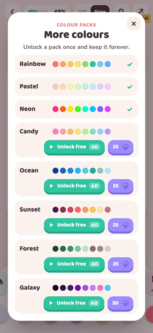
Every picture starts with tracing the lines. After that, switch the toggle at the top from 123 to Free, so you choose every color yourself. In free mode, the color row shows the colors from every pack you own. The Rainbow pack is free from the start. To add Pastel, Neon, Candy, Ocean, Sunset, Forest or Galaxy, tap the plus button at the end of the color row to open More colours. You unlock a pack once, by watching an optional video or with gems, and keep it.
Here is a simple way to play:
- Open one pack in your head. Look at a single row on the More colours sheet, like Ocean or Sunset, and choose your three colors from it. Colors from one pack already sit well together.
- Pick your picture. A simple shape, like a whale, a boba cup or a sleepy bunny, is easiest for a first try.
- Fill the big areas first with your main color, then add the partner, and save the accent for last.
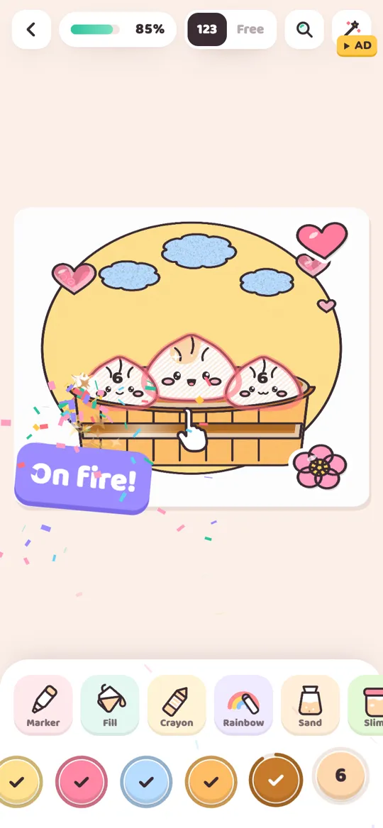
- Use the tools for variety. The tool changes the texture, not the color. Ombre fades your color into a lighter shade of itself, Crayon adds paper grain and Sand adds a speckled pour. One color on three tools looks like three different materials.
- Watch out for two tools. The Rainbow brush paints its own rainbow of colors, and Neon glows on a dark backdrop, so both add colors outside your set. Skip them if you want to stay strict.
There are no timers, so take as long as you like. When you finish, the picture comes alive and plays a timelapse of everything you colored. Our guide to all 12 tools explains each texture in more detail.
Common mistakes and quick fixes
- All three colors are the same lightness. The page looks flat. Swap one for a much lighter or darker version.
- The accent is everywhere. It stops being special. Keep it to two or three small spots.
- Too many mixes. Layering is great, but if every area is a blend, the picture goes muddy. Keep some areas pure.
FAQ
How many colors is a limited palette?
Most limited palette challenges use three colors, and some allow up to five. Black outlines and white paper usually do not count, and lighter or darker versions of a chosen color count as the same color.
What are good colors for a three color challenge?
Pick a calm main color, a partner that sits near it on the color wheel and one small, bright accent. Navy, aqua and sandy yellow, or blush pink, cream and red, are easy sets to start with.
How do I get more shades from only three colors?
Press lighter or harder, layer one color over another, use gradients that fade to a lighter shade, add texture like dots or crosshatching, and leave small patches of white as highlights.
Is a limited palette challenge good for kids?
It can be a fun game for children, because there are fewer choices to make and every picture ends up looking neat. Let them pick their own three colors and keep the rules light and playful.
Can I do a limited palette challenge in Colour Cozy?
Yes. Switch to Free mode and choose only three colors from the color row. Picking all three from one pack, like Ocean or Sunset, keeps them in the same family. Skip the Rainbow and Neon tools if you want to stay strict.