 Colour Cozy
Complementary colors, explained simply for coloring
Red and green, blue and orange, yellow and purple. Learn why these opposite pairs glow next to each other, and how to use them without making a page loud.
In this guide
Complementary colors are pairs that sit directly across from each other on the color wheel: red and green, blue and orange, and yellow and purple. Placed side by side, each one makes the other look brighter, which is why they are great for drawing the eye. On a coloring page, use one color of the pair for most of the area and the other for a small detail, and soften one side with a lighter shade so the page stays calm.
Have you ever colored a red apple on a green leaf and noticed how bright it suddenly looked? That is complementary color at work. It is one of the simplest ideas in color theory, and one of the most useful for coloring pages.
This guide has complementary colors explained in plain words, shows the three main pairs, and gives you five easy ways to use them. You do not need any art training. A box of pencils or a coloring app is enough.
What are complementary colors?
Picture the color wheel: red, orange, yellow, green, blue and purple in a circle. If you need a quick refresher, our color theory basics for coloring pages walks around the wheel in a minute.
Complementary colors are the pairs that sit straight across from each other on that circle. The three main pairs are:
- Red and green. Think of strawberries, holly berries or a ladybird on a leaf.
- Blue and orange. Think of a goldfish in water or an orange sun in a blue sky.
- Yellow and purple. Think of pansies, or a pale star in a purple night.
Every in-between color has a partner too. Yellow-green sits across from red-purple, and blue-green sits across from red-orange. You do not need to learn them all. If you remember the three main pairs, you can find the rest by looking straight across the wheel.
There is a handy pattern hiding in these pairs. Each one has one warm color and one cool color. Red, orange and yellow are warm; green, blue and purple are cool. That is part of why opposites feel so lively together. Our guide to warm and cool colors goes deeper on that side of it.

Why opposite colors make each other pop
Opposite colors share almost nothing. Orange has no blue in it, and blue has no orange. When they touch, your eye notices the difference strongly, so both colors seem brighter and the edge between them looks sharp.
That makes complementary pairs great for one job: pulling attention to one spot. A small orange fish in a big blue sea is the first thing anyone sees.
The same strength can also go wrong. If you use two very bright opposites in equal amounts, right next to each other, the page can feel loud or even buzzy. The fix is simple, and it is the heart of the next section: let one color lead and the other one help.
Five easy ways to use complementary colors on a coloring page
- Choose your main color first. Pick the color you want most of the picture to be, such as blue for an underwater scene.
- Find its partner across the wheel. For blue, that is orange. Keep it next to your pencils or in your palette so you remember to use it.
- Use the partner small. Put the opposite color on one or two small areas only: a fish, a button, a flower centre, a star. A rough guide is lots of the main color and a little of the partner.
- Soften one side. Use a lighter or duller shade for the big areas, like pale blue instead of bright blue. Keep the bright shade of the partner for the small detail. Soft plus bright looks calm; bright plus bright looks loud.
- Add a rest color. Leave some white, cream or light gray between big patches of opposites. That pause stops the colors from fighting along every edge.
Pair ideas for cute pictures
Here are some ready-made ways to try each pair. Each one uses the "one leads, one helps" rule.
- Red and green: berry cake or strawberry. Pink and soft red for the cake or fruit, with a few small green leaves on top. Using pink instead of pure red keeps it sweet rather than festive.
- Blue and orange: whale or goldfish bowl. A cool blue sea with one orange detail, like a starfish or the fish itself. Our ocean color palette for a whale picture has more ocean shades to build from.
- Yellow and purple: unicorn or night sky. A purple mane or a purple sky with pale yellow stars or a yellow horn. The galaxy color palette ideas post shows how purple-heavy pages stay cozy.
- Blue-green and coral: mermaid or sea turtle. Teal for the body or water, coral for shells. This is a softer cousin of blue and orange.
Trying complementary colors in Colour Cozy
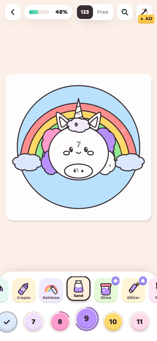
Colour Cozy is a calm coloring game where you trace a picture, then color by number or switch to free mode. In color by number the colors are picked for you. Free mode is where you can practise complementary pairs yourself.
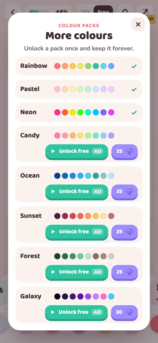
The free Rainbow pack covers the whole wheel, with pinks and reds, orange, yellows, greens, teal, blues and purples. That means all three main pairs are there from the start. Some of the other color packs already use a small opposite on purpose:
- Galaxy is mostly deep purples, with a pale yellow among its shades. That is a ready-made yellow and purple pair for stars.
- Ocean is mostly blues and teals, with one sandy yellow for a warm touch.
- Forest is mostly greens and browns, with a golden yellow and a deep orange for small bright details.
The extra packs unlock once, with an optional video or with gems, and then stay unlocked. Tools like sand and glitter make a small partner-color detail stand out even more, because the texture catches the eye as well as the color.
Common mistakes and quick fixes
- Half and half. An equal split of two bright opposites looks busy. Make one color clearly the main one.
- The edge buzzes. Bright red right against bright green can seem to flicker. Lighten one of them, or add a thin white or cream gap.
- Muddy shading. Shading orange with blue on paper can turn it brown. That can be lovely for shadows, but use a very light touch and test on scrap paper first.
- Too many pairs at once. Using all three pairs on one small picture loses the effect. Pick one pair per picture and let it do the work.
If you want more ways to build calm sets around one shared idea, read how to choose colors that go together.
FAQ
What are the three main complementary color pairs?
Red and green, blue and orange, and yellow and purple. Each pair sits straight across from each other on the color wheel.
Why do complementary colors look so bright together?
They share almost nothing, so the eye notices a strong difference where they meet. That contrast makes both colors seem brighter and the edge look sharp.
Do complementary colors always look good together?
They work best when one color leads and the other is used in small amounts. Two bright opposites in equal amounts, side by side, can look loud.
How do I explain complementary colors to a child?
Call them color opposites. Show the color wheel, point across the circle, and try a simple test: color a small orange fish on blue paper and see how it shines.
Can I use complementary colors with pastels?
Yes. Soft pairs like pale pink and mint, or lilac and butter yellow, keep the contrast but feel gentle, which suits cute and cozy pictures.