 Colour Cozy
Sunset coloring ideas for skies that glow
Golden yellow, coral, raspberry and a dusky purple top. Here is how to turn a plain sky into an evening that glows.
In this guide
A sunset sky works best in bands: the lightest, warmest color (pale or golden yellow) sits low near the horizon, orange and coral come next, then pink or raspberry, and a cool dusky purple or slate blue fills the top. Color the light bands first, blend where they meet, and finish with dark silhouettes like hills, a whale's tail or a rocket so the warm colors glow.
A sunset is one of the easiest ways to make a coloring page feel special. Swap a plain blue sky for warm stripes of gold and coral, and even a simple picture of a basket of dumplings looks like a cozy evening.
The tricky part is the order. Put the wrong shade at the top and the sky looks upside down. Press too hard too early and the bands turn into stripes instead of a soft fade. Below are six sunset coloring ideas, a step-by-step order that works on paper or on a screen, and the small details that make a sky look warm.
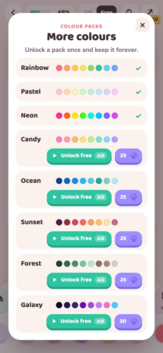
In Colour Cozy, the Sunset color pack has ten shades for exactly this: deep plum, berry red, raspberry, coral, orange, golden yellow, pale butter yellow, dusty rose, dusty purple and slate blue. You can use every idea here with that pack, with pencils, or in any other app.
How a sunset sky is built
Real sunsets change all the time, but most pictures that look right follow the same three rules.
- Light and warm at the bottom. The sun has just dipped, so the brightest color hugs the horizon: pale yellow or golden yellow.
- Warmer and deeper as you go up. Orange, then coral, then pink or raspberry. Each band is a little darker than the one below it.
- Cool at the very top. The sky far from the sun is already turning to night. A dusky purple or slate blue at the top makes the warm bands look even brighter.
Dark shapes along the bottom, like hills, waves or a tree line, finish the effect. They sit against the bright horizon and make it glow by contrast.
Six sunset coloring ideas
1. Classic golden hour
Shades: pale butter yellow, golden yellow, orange and coral. Use it for: big open skies over a field, a beach or a city. Tip: keep it to four warm steps with no purple. It feels like the moment just before the sun goes down.
2. Pink lemonade sky
Shades: pale butter yellow, dusty rose, coral and raspberry. Use it for: cute pictures like a sleepy bunny or an ice cream cone. Tip: let dusty rose take the biggest area and save raspberry for thin streaks of cloud.
3. Dusk over the sea
Shades: golden yellow, coral, dusty purple and slate blue. Use it for: ocean scenes, and especially a whale with its tail out of the water. Tip: reflect the sky in the water. Use the same shades, upside down, in shorter strokes. For daytime sea colors, see our ocean palette ideas for a whale picture.
4. Last light
Shades: orange, raspberry, berry red and deep plum. Use it for: dramatic pictures such as a monster truck or a space rocket. Tip: this is the darkest of the six. Keep a thin line of orange at the horizon so the picture still feels warm.
5. Sunset inside a shape
Shades: golden yellow, coral and dusty rose. Use it for: a single round shape, like the big circle behind a character, a balloon or a planet. Tip: fill the shape top to bottom with three bands and leave the rest of the picture plain. It turns a simple background circle into a little evening scene.
6. Sunset and stars
Shades: coral and orange low down, then dusty purple, then slate blue at the top, with a few pale yellow dots. Use it for: the moment day turns into night. Tip: add the stars only in the top blue band, never in the warm part. If you love this look, our galaxy color palette ideas take it all the way into space.
How to color a sunset sky, step by step
This order keeps the bands soft and stops the sky from turning muddy.
- Pick four or five shades from one palette above, from lightest to darkest.
- Mark the horizon. Decide where the ground or sea starts. Everything above that line is sky.
- Color the lightest band first. Fill a wide strip just above the horizon with pale or golden yellow.
- Work upward one band at a time. Add orange, then coral, then pink. Overlap each new band a little with the one below.
- Blend the edges. On paper, go over each overlap with the lighter color using gentle pressure. On a screen, a gradient tool does this for you.
- Add the cool top. Finish the highest part of the sky in dusty purple or slate blue.
- Add silhouettes last. Color hills, trees, waves or a character's outline in deep plum. A dark shape against a light horizon is what makes a sunset glow.
If you want more practice with soft fades before you start, our guide on how to color an ombre gradient walks through one-color and two-color blends.

Coloring a sunset in Colour Cozy
Color packs are used in free mode, where you pick every color yourself. Tap the plus button at the end of the color row to open the More colours sheet, then choose Sunset. A pack unlocks once with an optional video or with gems, and it stays unlocked. Our guide on how to unlock colour packs explains the details.
A few tools suit sunsets well:
- Ombre fills an area with a soft fade from your color to a lighter shade of it. Try it on each band of the sky, or on a whole round sun.
- Spray builds up a fine mist, which is great for soft clouds catching the light.
- Rainbow fills an area with a ready-made rainbow fade. It is bright and fun, but for a real evening look, the warm pack shades are calmer.
Not sure whether to color by number or freely? Our comparison of color by number and free coloring explains both modes.

Common sunset mistakes
- Starting with the darkest color. Dark shades are hard to cover. Lay down the light bands first.
- Hard stripes. If you can see clean lines between colors, go back over each edge with the lighter shade.
- Too many colors. Four or five steps look smoother than ten. Pick one palette and stay with it.
- No dark shapes. A sky with nothing in front of it can look flat. Even a thin line of dark hills helps.
- Blue at the bottom. Keep cool shades high in the sky. Near the horizon, warm colors look right.
For help choosing shades that sit well side by side, see how to choose colors that go together.
FAQ
What colors do you need to color a sunset?
Most sunsets use pale or golden yellow near the horizon, then orange, coral and pink, and a dusky purple or slate blue at the top. Add a dark plum or brown for hills and silhouettes.
Which color goes at the bottom of a sunset sky?
The lightest, warmest color goes at the bottom, closest to where the sun has set. Pale yellow or golden yellow works well, with deeper shades above it.
How do I make a sunset look smooth instead of striped?
Color the light bands first, overlap each new band a little, and blend the edges with gentle pressure using the lighter color. In an app, a gradient or ombre tool makes each band fade on its own.
What pictures suit sunset colors?
Open skies, beaches, hills and the sea are classic choices. Sunset colors also look lovely behind a cute character, such as a whale's tail, a sleepy bunny or a space rocket.
Is there a sunset color pack in Colour Cozy?
Yes. The Sunset pack has ten warm and dusky shades. In free mode, tap the plus button at the end of the color row, pick Sunset, and unlock it once with an optional video or gems.