 Colour Cozy
Warm and cool colors, explained simply
Sunshine on one side, shade on the other. Once you can sort your pencils into two piles, picking colors for any picture gets much easier.

In this guide
Warm colors are reds, oranges and yellows, the shades of fire and sunshine. Cool colors are blues, greens and purples, the shades of water, shade and night. Warm shades seem to come forward and feel cozy, cool shades seem to sit back and feel calm. On a coloring page, pick one side for most of the picture and add a small touch from the other side to make it stand out.
Tip a box of pencils onto the table and you can sort it into two piles without thinking very hard. One pile looks like a campfire: red, orange, yellow. The other looks like a lake in the evening: blue, green, purple. Artists call this color temperature, and it is one of the easiest art ideas to learn.
It is also one of the most useful. Knowing which pile a shade belongs to helps you set the mood of a picture, make the main character stand out and fix a page that looks flat. This guide keeps it simple, with a sorting test, five ways to use the idea and a short practice exercise.
Which colors are warm and which are cool?
Picture the color wheel, a circle of colors in rainbow order. Draw a line through the middle and you get two halves.
- Warm side: red, orange and yellow, plus the shades made from them, like peach, coral, gold and most browns.
- Cool side: blue, green and purple, plus shades like teal, mint, navy and lavender.
What about black, white and gray? They are neutrals. They do not sit on either side, so you can use them with anything. If the color wheel is new to you, our color theory basics for coloring pages cover it in a minute.
The tricky ones: green, purple and pink
Some shades sit right on the border, and that is where people get confused. The trick is to ask which neighbor the shade leans toward.
- Green is made of yellow and blue. A lime or olive green has more yellow in it, so it feels warmer. A teal or pine green has more blue, so it feels cooler.
- Purple is made of red and blue. A plum or magenta leans red and feels warmer. A violet or indigo leans blue and feels cooler.
- Pink is a light red, so it is usually warm. A pink with a hint of purple, like orchid, feels cooler than a peachy pink.
So temperature is not a fixed label. It is a comparison. A shade is only warm or cool next to something else. Put a teal beside a navy and the teal looks warm. Put the same teal beside an orange and it looks cool.
What warm and cool colors do in a picture
Two things happen when you put these shades on a page.
They set the mood. A page of mostly reds, oranges and yellows feels sunny, lively and cozy, like a kitchen or a beach at noon. A page of mostly blues and greens feels quiet and fresh, like a pond, a snowy day or bedtime.
They suggest near and far. Warm shades seem to step toward you. Cool shades seem to step back.
The finished dumpling picture at the top of this page shows both. The big yellow circle, the peach dumplings and the orange basket are all warm, so the whole picture feels snug. The three small blue clouds are the only cool part, and they pop precisely because nothing else is blue.
Five easy ways to use temperature on a coloring page
- Pick a side first. Before you choose a single shade, decide if the picture should feel warm or cool. A sleepy bunny at night? Cool. A stack of pancakes? Warm.
- Use a small touch from the other side. Keep most of the page on one side and add one or two small areas from the opposite one. Think of it as mostly one pile, with a pinch of the other.
- Warm for the star, cool for the background. Color the main character in warm shades and the area behind it in cool ones. The character will seem to stand in front.
- Shade with the opposite temperature. For a shadow on a warm object, try a slightly cooler, darker shade instead of black. A plum shadow on an orange pumpkin looks richer than a gray one.
- Match the light. Sunlight and lamps are warm, so sunny scenes suit golden yellows and corals. Moonlight and snow are cool, so night scenes suit blues and violets with one small warm window or star.
For more ready-made combinations, see how to choose colors that go together.

A ten-minute practice exercise
You only need one simple picture and a handful of pencils or an app.
- Sort your colors. Make a warm pile and a cool pile. Put black, white and gray to one side.
- Color the picture once in warm shades only. Notice how it feels.
- Color a copy in cool shades only. Same picture, very different mood.
- Make a third version. Use your favorite of the two, then change one small detail to the opposite pile, such as a bow, a star or a cloud.
- Compare all three. Most people like the third one best, because the small contrast gives the eye somewhere to land.
Trying it in Colour Cozy
Colour Cozy is a calm coloring game where you trace a picture, then color by number or freely. In color by number the shades are chosen for you, which makes it an easy way to spot temperature at work. In free mode you choose every shade yourself, so you can run the exercise above.
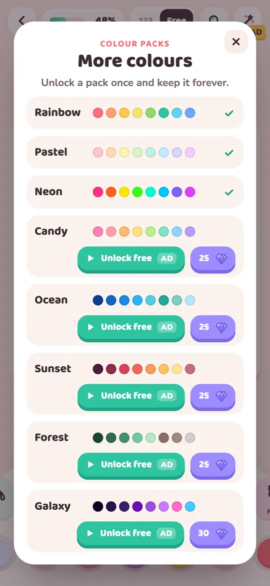
The color packs help here, because several of them lean clearly to one side:
- Sunset is mostly warm: deep reds, coral, orange and soft yellow, with a dusky purple and a slate blue at the end for contrast.
- Ocean is mostly cool: blues, turquoise and teal, with one sandy yellow as the warm touch.
- Forest mixes cool greens with warm browns and two golden yellows.
Each of those packs already follows tip 2: mostly one side, plus a little of the other. The Rainbow pack is free from the start, and the other packs unlock once with an optional video or with gems and then stay unlocked.
Want a full plan for either side? Try our sunset coloring ideas for a warm page, or the ocean color palette for a whale picture for a cool one.
Common mistakes and quick fixes
- Half warm, half cool. An even split can make a page feel unsure of itself. Let one side clearly win.
- Only one side. A picture with no contrast at all can look flat. Add one small touch from the other pile.
- Warm background, warm character. If the character disappears, cool the background down or make it much lighter.
- Worrying about the border shades. If you cannot decide whether a green is warm or cool, it is probably close to the middle and will work with either side.
FAQ
What are warm and cool colors in simple words?
Warm colors are reds, oranges and yellows, like fire and sunshine. Cool colors are blues, greens and purples, like water, shade and the night sky. Black, white and gray are neutral.
Is green a warm or a cool color?
Green is usually counted as cool, but it depends on the shade. A yellowish green such as lime or olive feels warmer, and a bluish green such as teal or pine feels cooler.
Is purple warm or cool?
Purple is usually counted as cool. A purple with more red in it, like plum or magenta, feels warmer, while a violet or indigo with more blue feels cooler.
Can I mix both kinds in one picture?
Yes, and most good pictures do. Let one side cover most of the page and use the other for a few small details. The contrast makes those details stand out.
How do I explain color temperature to a child?
Ask which colors remind them of the sun or a campfire and which remind them of water or snow. Then sort crayons into a warm pile and a cool pile together and color one picture from each pile.
Does Colour Cozy have warm and cool palettes?
Yes. The Sunset pack is mostly warm and the Ocean pack is mostly cool. Colour Cozy is coming soon to Google Play for Android and is free to play, with optional videos and purchases.