 Colour Cozy
Neon color palette tips for pictures that glow
Hot pink, electric lime and aqua look amazing, until a whole page of them turns loud and flat. Here is how to pick, pair and place neon shades so they really pop.
In this guide
Neon colors glow best when they have something dark or quiet next to them. Pick two or three bright shades, such as hot pink, aqua and electric lime, put them on small shapes, and give the rest of the picture a deep navy, plum or soft neutral. Pair neon shades that sit far apart on the color wheel for extra punch, and leave some calm space so the brights do not fight each other.
Neon shades are the loudest colors in any box. Hot pink, electric lime, laser yellow and aqua feel like light rather than paint. That is exactly why they are fun, and also why a page colored only in neon can look busy and flat.
The fix is not to avoid them. It is to give them a stage. These neon color palette tips show you which shades to pair, where to place them and how much to use, with five combos you can try on paper or on screen.
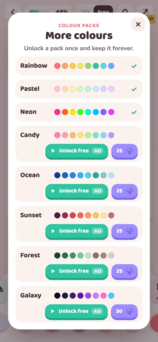
In Colour Cozy, the Neon pack has ten shades: hot pink, bright orange, laser yellow, electric green, aqua, bright sky blue, violet, magenta, signal red and lime yellow. The ideas below work with that pack, with highlighter pens or with any other coloring app.
Why neon colors need a dark partner
A neon shade looks like it glows because your eye compares it with what sits next to it. Put electric green on white paper and it just looks bright. Put it next to deep navy and it seems to give off light.
Three simple rules come out of that:
- Dark around, bright inside. Color the background or the big shapes in a deep shade, then keep neon for the edges, details and centers.
- Less is louder. Two or three neon shades on one picture usually look stronger than all ten at once.
- Leave quiet space. A few areas in a soft neutral, like light grey or cream, give the eye a rest and make the neon parts feel brighter.
If you like dark, glowing pictures, our galaxy color palette ideas use the same trick with deep purples and tiny bright stars.
Five bright neon color combinations
1. Arcade night
Shades: hot pink, aqua and violet on a dark navy or plum background. Use it for: rockets, robots, game-style signs and anything that should look like a light-up arcade. Tip: outline shapes in aqua and fill the middles in violet. A single hot pink detail, like a button or a flame, becomes the star.
2. Lime and pink pop
Shades: electric green and hot pink, with white. Use it for: cute characters, stickers and bold summer pictures. Tip: these two sit far apart on the color wheel, so they make each other look stronger. Keep one of them on bigger shapes and the other on small dots. Our page on complementary colors explains why opposite colors pop.
3. Sunny highlighter
Shades: laser yellow, bright orange and signal red. Use it for: flames, sunbursts, fruit and party pictures. Tip: this one is all warm, so add one cool shade, like a touch of aqua, so the picture does not feel too hot.
4. Cool glow
Shades: aqua, bright sky blue and violet. Use it for: whales, ice, water, jellyfish-style shapes and night skies. Tip: the gentlest neon combo. Put aqua at the light end and violet at the dark end, and it reads almost like a soft gradient.
5. One neon accent
Shades: a calm palette, like pastels or soft browns, plus one neon shade. Use it for: any picture where one thing should stand out, like a monster truck's wheels, a bunny's bow or a candle flame. Tip: color the whole picture in quiet shades first, then add the neon to one small area. It will catch the eye straight away.
How to color with neon, step by step
This order keeps neon pictures bright instead of muddy. It works with pens, pencils or an app.
- Choose a dark or quiet base. Pick one deep shade, like navy, plum or dark teal, or one soft neutral if you want a lighter look.
- Choose two or three neon shades. Use one of the combos above, or pick one warm and one cool neon so they balance.
- Color the base first. Fill the background or the biggest shapes with your dark or quiet shade. This sets the stage.
- Add the main neon. Put your strongest shade on the shape that matters most, like the vehicle, the animal or the sign.
- Add the second neon to edges and details. Outlines, stripes, dots and small lights are perfect for it.
- Stop early. Step back and look. If the picture already pops, leave the remaining areas calm.
In Colour Cozy, colour packs are used in free mode, where you choose every color yourself. Tap the plus button at the end of the color row to open the More colours sheet and pick Neon. The pack unlocks once, with an optional video or with gems, and then stays. Our colour pack guide walks through each step.
The Neon tool and the Neon pack are different things
This trips people up, so it is worth saying clearly.
- The Neon pack is a set of ten bright colors. It changes which colors you can pick.
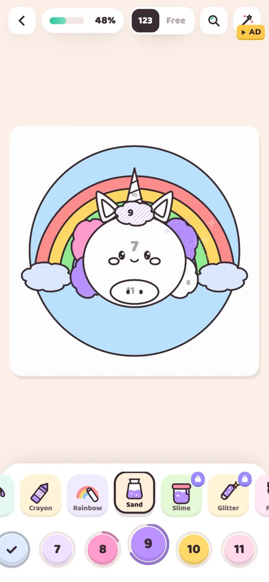
- The Neon tool is one of the twelve tools. It paints the area in a dark night color and gives its edge a glowing line in the color you picked, a bit like a small neon sign.
You can use them together or apart. A glowing outline in laser yellow on a star looks like a light-up sign. A plain fill of hot pink from the Neon pack looks bold and flat, which suits stickers and cartoons. The Neon tool is a pro tool, so it shows a small lock until you try it for one picture with an optional video or unlock it with gems. Our guide to all 12 Colour Cozy tools covers how every tool behaves.
Common neon coloring mistakes
- Every area in neon. Without quiet space, nothing stands out. Choose the two or three areas that matter most.
- Neon on a white background only. It still looks nice, but it will not glow. Try one dark area behind the bright shape.
- Neon for small faces and eyes. Tiny features can disappear in very bright colors. Keep faces in softer shades and let neon frame them.
- Too many warm neons together. Pink, orange, red and yellow side by side can blur into one hot blob. Add a cool shade to break it up.
- Mixing neon with muddy shades. Brown or grey right next to neon can make it look dull. Put a dark, clean color between them instead.
Where neon fits best
Neon is not right for every picture, and that is fine. It shines on things that light up or move fast in real life: signs, rockets, cars and trucks, fireworks, glow sticks and party scenes. It is also fun as one surprise detail on a cozy picture, like a glowing heart on a sleepy bunny.
For calm, soft pictures, a gentler set often feels better. Our pastel color palettes are the quiet opposite of neon, and you can even mix the two: pastels everywhere, one neon spark.
FAQ
What colors are in a neon color palette?
Most neon palettes use very bright, saturated shades such as hot pink, electric green, laser yellow, aqua, bright blue, orange and magenta. They work best with one deep or quiet color next to them.
How do I make neon colors look like they glow?
Put them next to a dark color, like navy, plum or deep teal. Bright shades beside a very dark shade look like they give off light, while on white they simply look bright.
What colors go well with neon pink?
Electric green and aqua make neon pink pop because they sit far from it on the color wheel. Dark navy or plum behind it makes it glow, and white keeps it fresh.
How many neon colors should I use on one picture?
Two or three is a good start. Use one as the main color, one for edges and details, and leave the rest of the picture in a dark or calm shade.
Is the Neon pack the same as the Neon tool in Colour Cozy?
No. The Neon pack adds ten bright colors to pick from in free mode. The Neon tool is a pro tool that paints an area dark with a glowing edge in the color you choose.