 Colour Cozy
An ocean color palette for a happy whale picture
Navy in the deep, aqua on the waves, a pale belly and one warm sun. Here is how to color a whale so the sea looks deep instead of flat.
In this guide
A good ocean palette uses three or four blues that step from dark to light: navy for deep water, a middle blue for the whale, aqua or teal for the waves and a pale ice blue for the belly and spray. Add one warm color, like sandy yellow for the sun, so the picture does not feel cold. Keep the darkest blue low in the picture and the lightest near the surface.
A whale is one of the friendliest things to color. It is a big, simple shape, so you can enjoy filling it without fiddly details. The challenge is that almost everything in an ocean scene is blue. If every part gets the same blue, the whale disappears into the sea.
The fix is to plan your blues before you start. Pick a few shades that are clearly lighter or darker than each other, give each one a job, and add a single warm color for contrast. Below are four palette ideas for a whale picture, a step-by-step order that works on paper or on a screen, and the tools that make water look wet.
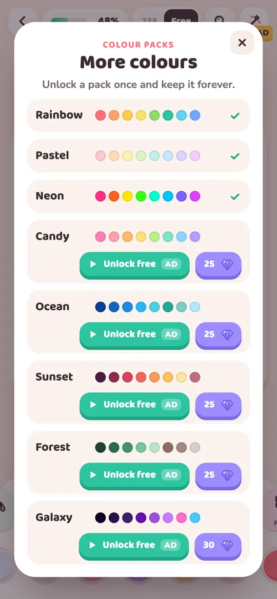
In Colour Cozy, the whale picture is called Happy Whale. It shows a smiling whale with a water spout, a bright sun in the corner and two rows of waves along the bottom. The Ocean color pack has ten shades that suit it well: navy, deep blue, medium blue, bright sky blue, aqua, teal, soft sea green, pale ice blue, sandy yellow and an off-white.
Why ocean pictures need more than one blue
Water looks deep because it gets darker the further down you look. A good sea picture copies that with a few simple rules.
- Dark at the bottom. Your darkest blue goes on the lowest band of waves or the deep water. It makes the sea feel heavy and calm.
- Lighter toward the top. Each wave or layer above it gets a slightly lighter shade. That step from dark to light is what makes water look deep.
- Make the whale stand out. The whale should be a blue that is clearly different from the water right next to it, either lighter or a different family, like teal against navy.
- Add one warm spot. A yellow sun, a pink cheek or a sandy shore keeps a page full of blue from feeling cold.
If you want to know why these rules work, our color theory basics for coloring pages explains value and warm and cool colors in plain words.
Four ocean palette ideas for a whale
1. Classic deep blue sea
Shades: navy, medium blue, bright sky blue, pale ice blue and sandy yellow. Where they go: navy on the bottom wave, sky blue on the top wave, medium blue on the whale's body, ice blue on its belly and spout, sandy yellow on the sun. Why it works: each blue is a clear step away from its neighbor, so the whale stays easy to see.
2. Tropical lagoon
Shades: teal, aqua, soft sea green, pale ice blue and sandy yellow. Where they go: teal on the lower waves, aqua on the upper waves, a light sea green or ice blue whale, and a big warm sun. Why it works: greener blues feel sunny and shallow, like clear water near a beach.
3. Moonlit whale
Shades: navy, deep blue, medium blue, pale ice blue and off-white. Where they go: navy and deep blue on the waves and background, medium blue on the whale, off-white on the sun so it becomes a moon. Why it works: a night sea is mostly dark, so the pale belly and moon glow. If you like dark, glowing pictures, our galaxy color palette ideas use the same trick with purples.
4. A whale that is not blue
Shades: a soft pink or lilac whale, with aqua and teal water and a yellow sun. Where they go: keep the sea in ocean blues and pick a color from a different pack for the whale, like a pink from Pastel or Candy. Why it works: a warm whale in cool water pops straight off the page. It is a fun choice for younger kids who love bright, playful pictures.
How to color a whale picture, step by step
This order works for almost any sea picture.
- Choose four or five shades from one palette above: one dark blue, one or two middle blues, one very light blue and one warm color.
- Start with the bottom wave. Color it in your darkest blue. This sets how deep the sea feels.
- Color the top wave a step lighter. It should look clearly different from the bottom wave, so you can see two layers of water.
- Fill the whale's body in a blue that is different from the waves next to it. Then color the striped belly and the little fin in your lightest shade.
- Color the spout in pale ice blue or off-white so the splash looks bright and light.
- Add the warm color last. Paint the sun in sandy yellow and check that it is the only big warm spot.
- Step back and compare. If the whale blends into the waves, make one of them lighter or darker. Small changes make a big difference.
In Colour Cozy, color packs are used in free mode, where you choose every color yourself. Switch the toggle at the top from 123 to Free, scroll to the end of the color row and tap the plus button to open More colours. Our guide on how to unlock colour packs shows each step. Happy Whale is part of the Cozy Critters pack, and new pictures unlock as you come back to play.
Tools that make water look wet
The tool you choose changes the texture, and some textures look a lot like water. In Colour Cozy:
- Fill pours color into an area with a wet edge, like paint soaking into paper. It is quick and clean for the whale's body.
- Ombre fills an area with a soft gradient from your color to a lighter shade of it. On a wave, it looks like light shining through the water.
- Spray builds up a fine mist. A few bursts of pale blue or white on top of a wave look like foam.
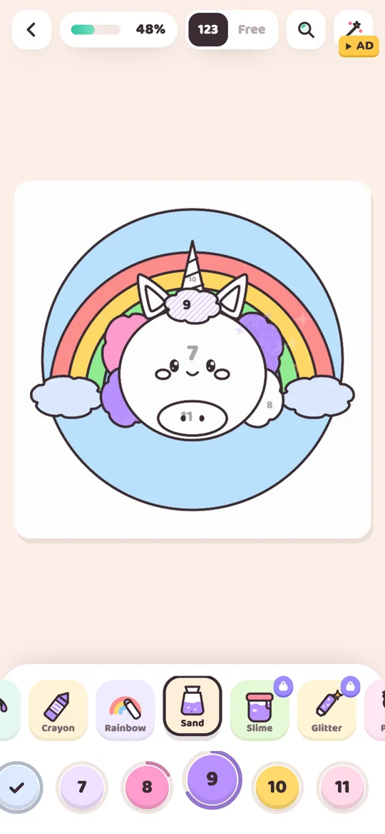
- Sand pours speckled grains that pile up. In sandy yellow it makes a beach; in pale blue it gives clouds or foam a soft, grainy look.
- Glitter is a pro tool that adds twinkling sparkles. A little on the spout looks like sun on the splash.
Our guide to all 12 Colour Cozy tools explains each one and how the pro tools unlock.

When you finish the whale, the picture comes alive: the whale swims and the waves roll. Tap it to play, then watch the timelapse of your coloring.
Common ocean coloring mistakes
- One blue everywhere. The whale and the sea melt into one shape. Use at least three clearly different blues.
- Dark on top, light below. It can look like the picture is upside down. Keep the darkest water at the bottom.
- No warm color at all. A page that is only blue can feel cold and flat. One yellow sun fixes it.
- Dark color on the face. Eyes and a smile are hard to see on navy. Keep the face area light.
If you would rather try something softer, our pastel color palettes turn the same whale into a gentle, sleepy picture.
FAQ
What colors are in an ocean color palette?
Most ocean palettes use three or four blues from dark to light, such as navy, medium blue, aqua and pale ice blue, often with a teal or sea green and one warm color like sandy yellow for the sun or a beach.
What color should I make a whale?
Blue or gray whales look natural, with a lighter belly. Make the body a blue that is clearly different from the water next to it. A pink or lilac whale in blue water is a fun, playful choice too.
How do I make water look deep in a coloring picture?
Use your darkest blue at the bottom and get lighter as you move up. Each layer of waves should be a clear step lighter than the one below it.
Which tools are best for coloring water?
Ombre adds a soft gradient that looks like light in water, and Spray makes foam on top of waves. Fill gives a quick, clean base color for big areas.
How do I get the Ocean pack in Colour Cozy?
In free mode, tap the plus button at the end of the color row to open More colours. You can unlock the Ocean pack once by watching an optional video or with gems, and you keep it.