 Colour Cozy
How to color an ombre gradient, step by step
A smooth fade from dark to light makes skies glow and water look deep. Here is how to get one right, on paper or on a screen.
In this guide
An ombre gradient is a smooth fade from one shade to another, usually from dark to light. To color one, pick a single color (or two neighbors on the color wheel), lay a light layer over the whole area, then build up the darker end with gentle pressure and blend where the shades meet. Ombre works best on large, simple areas like skies, water, backgrounds and hair.
Ombre comes from the French word for "shaded". In coloring, it means a fill that changes slowly from one tone to another instead of staying flat. A sky that is deep orange at the horizon and pale yellow at the top is ombre. So is a whale that is navy on its back and light blue on its belly.
Learning how to color an ombre gradient is one of the quickest ways to make a simple page look finished. It adds depth without extra detail, and it is relaxing to do because the motion is slow and repetitive. This guide covers the two main types, the steps for paper and for apps, and where a fade looks best.
Two kinds of ombre: one color or two
Before you start, decide which kind of fade you want.
One-color ombre uses a single color that goes from strong to pale. Think dark pink fading to almost white. It is the easiest type, because there is no chance of two colors clashing in the middle. It looks soft and tidy, which suits cute pictures.
Two-color ombre fades from one color into a different one, such as orange into yellow, or blue into purple. It looks richer, but the two colors need to get along. The safest choice is two colors that sit next to each other on the color wheel, like red and orange, yellow and green, or blue and violet. Colors from opposite sides, like red and green, tend to turn muddy where they meet.
If you are new to blending, start with one color. Once that feels easy, move on to two.
How to color an ombre gradient on paper
Colored pencils are the friendliest tool for this, because you control the darkness with pressure. Markers work too, with one extra trick.
- Choose your shades. For a one-color fade, one pencil is enough. For two colors, pick neighbors on the color wheel, plus a light shade of each if you have them.
- Mark the direction. Decide where the dark end goes. In skies the dark end is often at the top or at the horizon. On round shapes it usually sits at the edge facing away from the light.
- Lay a light base. Color the whole area very lightly with your lightest shade, using small circles or short strokes. Leave the pale end almost untouched.
- Build the dark end. Go back to the dark side and add layers with a little more pressure each time. Stop each layer a bit earlier than the last one, so the color steps down gradually.
- Blend the middle. Where the shades meet, go over the area with the lighter color using soft pressure. This smooths the line between them.
- Check from a distance. Hold the page at arm's length. If you can see a clear stripe, add another soft layer across it.
With markers, work fast while the ink is still wet, and overlap the colors slightly. Many people test their fade on scrap paper first, which is a good habit with any new set of pens.
How to color an ombre gradient in an app
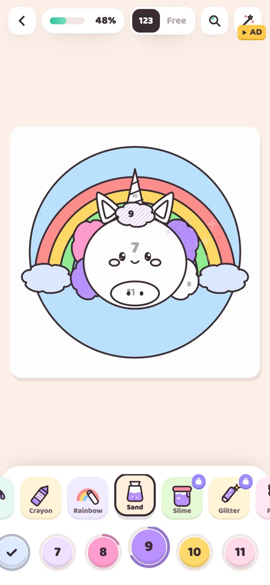
Coloring apps make gradients much quicker, because the blending is done for you. In Colour Cozy, Ombre is one of the 12 tools, and it is free to use from the start.
- Trace the picture to wake it up, as with every page.
- Pick the Ombre tool from the tool row.
- Choose a color. This is the strong end of your fade.
- Tap an area. It fills with your color at the top, fading to a much lighter tint lower down, with a soft swoosh sound.
- Repeat on matching areas so the light falls the same way across the picture.
Because the tool fades one color into its own lighter tint, it gives you a neat one-color ombre every time. For a two-color look, color neighboring areas with neighboring colors, for example a sky in one orange and the hills below in a warm red. You can do this in free mode, where you choose every color yourself. Not sure which mode suits you? Our guide to color by number and free coloring explains both.

The Rainbow tool is a cousin of ombre: as you drag your finger, the color moves through the rainbow, so long strokes leave a multicolor trail. Use it for unicorn manes and party scenes, and save Ombre for calm fades.
Where ombre looks best
A gradient needs room to change. On a tiny area, like an eye or a button, you will not see it at all. These spots show it off:
- Skies. The classic. A sunset fade from orange to yellow, or a night sky from deep blue to violet.
- Water. Darker at the bottom, lighter near the surface, which hints at depth. A whale or a fish bowl looks great this way.
- Backgrounds. A plain circle or square behind a character gets instant glow from a gentle fade.
- Round shapes. Balloons, bubbles, fruit and bubble tea pearls look rounder when one edge is darker.
- Hair, fur and tails. Darker roots fading to lighter tips look soft and natural.
- Vehicles. A rocket or a monster truck body with a fade looks shiny and fast.
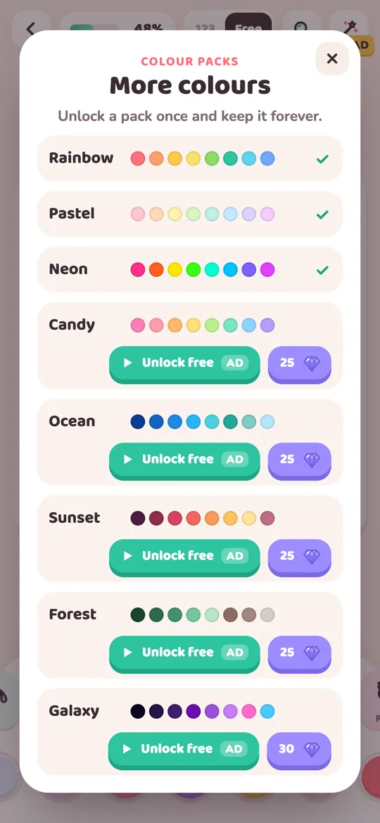
Picking shades is easier when the colors already come in order. In Colour Cozy, the Ocean, Sunset and Galaxy packs each start with deep shades and move toward lighter ones, so neighboring dots often make natural pairs for a two-color fade. Pastel shades blend beautifully too; see our list of pastel color palettes for soft combinations that fade well.

Common ombre mistakes and quick fixes
- A hard line in the middle. You pressed too hard too soon. Add soft layers of the lighter color over the line until it melts away.
- Muddy middle. The two colors are too far apart on the color wheel. Swap one for a neighbor, or switch to a one-color fade.
- Every area faded. When everything has a gradient, nothing stands out. Use ombre on two or three big areas and keep the rest flat.
- Light coming from everywhere. If the sky is dark at the top but the water is dark on the left, the picture feels confused. Keep the dark end on the same side across the page.
- Too short a fade. On a small area the change looks like a smudge. Choose a bigger area, or use a flat color there instead.
Once you are comfortable with gradients, try one picture where only the background is ombre and everything else is flat. It is a simple way to see how much a single fade can lift a page.
FAQ
What is ombre in coloring?
Ombre is a smooth fade from one shade to another, usually from dark to light. It can use one color fading to a pale tint, or two neighboring colors blending into each other, like orange into yellow.
What is the difference between ombre and a gradient?
They mean almost the same thing. Gradient is the general word for any gradual color change. Ombre usually describes a fade from dark to light, often within one color family.
Which colors are best for a two-color ombre?
Colors that sit next to each other on the color wheel blend best, such as red and orange, yellow and green, or blue and purple. Opposite colors like red and green often turn brown where they meet.
How do I blend an ombre with colored pencils?
Lay a light base over the whole area, build the dark end with gradually more pressure, then go over the middle with the lighter shade using soft strokes. Several gentle layers blend better than one heavy one.
Does Colour Cozy have an ombre tool?
Yes. Ombre is one of the 12 tools and is free from the start. Pick a color and tap an area, and it fills with that color fading to a lighter tint.