 Colour Cozy
Forest color palette ideas for calm, leafy pictures
A forest is not just green. Here is how to mix dark pines, soft mint, bark browns and a little sunlight so your woodland picture feels deep and alive.
In this guide
A good forest palette uses three or four greens that step from very dark to very light, one or two browns for bark and soil, and a small warm accent such as sunny yellow or orange for light, flowers or leaves. Put the darkest green on the biggest, farthest shapes, the lighter greens on the parts closest to the light, and keep the warm accent tiny so it glows.
Forests look easy to color until you try. You grab a green pencil, fill every tree with it, and the picture turns into one flat green blob. Real woods have dozens of greens in them, plus brown bark, grey-beige stones and spots of sunlight between the leaves.
The fix is not more colors. It is a small set of colors chosen to work together, used in the right places. Below are five woodland palettes you can use on paper or on a screen, a step-by-step order for coloring trees, and a few mistakes to avoid.
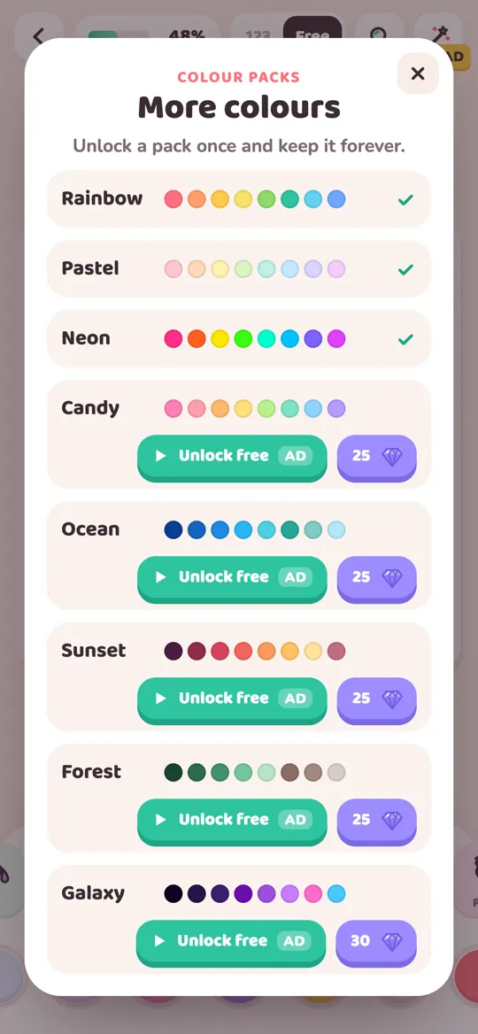
In Colour Cozy, the Forest pack holds ten shades built for this: a deep pine green, a forest green, a mid green, a soft mint, a pale green, a warm brown, a lighter taupe brown, a pale beige, a sunny yellow and a deep orange. Every idea here works with that set, but you can match it with pencils or markers too.
What makes a forest palette work
Most woodland pictures you love follow three simple rules.
- Use a ladder of greens. Pick one very dark green, one middle green and one or two light greens. The steps between them create depth, so trees look round instead of flat.
- Add earth colors. Brown for trunks and soil and a pale beige for paths, stones or mushrooms stop the picture from being all leaves. Green looks greener next to brown.
- Save one warm spark. A little yellow or orange reads as sunlight, a flower or a falling leaf. Keep it small and it becomes the first thing the eye finds.
Greens are a family of colors that sit side by side on the color wheel, so they almost always look calm together. Our guide on how to choose colors that go together explains why neighbors on the wheel feel peaceful.
Five forest color palette ideas
1. Deep pine woods
Shades: deep pine green, forest green, mid green, warm brown. Use it for: tall evergreen trees, shady backgrounds and quiet night-time woods. Tip: color the farthest trees in the darkest green and the closest ones in mid green. The picture instantly gains distance.
2. Fresh spring meadow
Shades: mid green, soft mint, pale green, sunny yellow. Use it for: grass, bushes, young leaves and bright, happy scenes with a cute critter in the middle. Tip: this one is light and airy. Add a single dark green shape, like a bush in the corner, so the picture still has some depth.
3. Mossy forest floor
Shades: forest green, soft mint, taupe brown, pale beige. Use it for: logs, stones, mushrooms and the ground under the trees. Tip: fill logs and rocks in brown or beige first, then add mint patches on top for moss. The soft green on a warm base looks fuzzy and old.
4. Autumn edge
Shades: forest green, warm brown, sunny yellow, deep orange. Use it for: fall trees, leaf piles and a cozy woodland path. Tip: keep a few green trees in the back so the yellow and orange ones in front really pop. If you like warm color mixes, our sunset coloring ideas use the same glowing oranges.
5. Forest colors on a cute character
Shades: mid green, soft mint, pale green, plus one pink or yellow from the picture's own colors. Use it for: a baby dinosaur, a frog, a leafy hat or anything that should look like it lives in the woods. Tip: use mid green for the body, pale green for the belly and soft mint for small spots. A little pink on the cheeks keeps it friendly.
How to color a forest, step by step
This order works for almost any woodland picture.
- Pick five or six shades from one palette: one dark green, one or two lighter greens, one brown, one light neutral and one warm accent.
- Color the background first. Fill the farthest trees or the sky behind them. Use the darkest green for far trees, or a pale color for an open sky.
- Color trunks and ground. Brown for bark, beige or taupe for paths and stones. Doing this early gives the leaves something to sit on.
- Add the leaves from dark to light. Fill each tree crown in a middle green, then add a lighter green on the side facing the sun.
- Drop in the warm spark. A few yellow flowers, an orange leaf or a patch of sunlight on the grass.
- Step back and check. If one area looks flat, add one shade lighter or darker next to it.
In Colour Cozy, color packs are used in free mode, where you choose every color yourself. Switch the top toggle from 123 to Free, swipe to the end of the color row and tap the plus button to open More colours. Our colour pack guide walks through every option.
Tools that suit woodland pictures
The texture of a tool can make leaves and bark feel more real. In Colour Cozy:
- Crayon has a paper grain that looks great on tree bark and soil.
- Spray builds a soft mist, ideal for light falling through leaves or a hazy far-off forest.
- Ombre fades a color into a lighter shade of itself, a neat way to color a tree crown that is dark at the bottom and bright at the top. See how to color ombre gradients for more.
- Sand pours colored grains that pile up, which makes a cute textured path or forest floor. Our sand tool guide shows how it behaves.

Not every picture needs to be a forest to use these colors. The monster truck, for example, sits on a little hill of ground. Fill it with taupe and warm brown, add a few mint tufts of grass, and it looks like it just drove out of the woods.
Common forest coloring mistakes
- One green for everything. This is the big one. Use at least three greens, even on a small picture.
- Bright green everywhere. Very saturated greens tire the eye. Let darker and softer greens cover most of the page.
- Forgetting the brown. Without trunks, soil or stones, leaves float. A little brown grounds the whole picture.
- A warm accent that is too big. If half the trees are orange, it stops being a spark. Keep yellow and orange for small shapes unless you are coloring a full autumn scene.
Looking for the opposite mood? Our galaxy color palette ideas use the same dark-to-light trick with purples and stars.
FAQ
What colors are in a forest color palette?
Most forest palettes mix three or four greens from deep pine to pale mint, one or two browns for bark and soil, a light beige for stones or paths, and a small warm accent such as yellow or orange.
How do I make trees look less flat?
Use a darker green on the shadow side of each tree crown and a lighter green on the side facing the sun. Far trees should be darker or softer than the trees closest to you.
What is a good color for tree trunks?
A warm brown works for most trunks. Add a lighter taupe or beige stripe down one side and the trunk looks round instead of flat.
Can I use forest colors for an autumn picture?
Yes. Keep a few green trees in the background and color the front trees in yellow, orange and brown. The green behind makes the warm colors look brighter.
How do I get the Forest pack in Colour Cozy?
In free mode, tap the plus button at the end of the color row to open More colours. You can unlock Forest once by watching an optional video or with gems, and it stays unlocked.