 Colour Cozy
Color theory basics for coloring pages, explained simply
You do not need art school to pick great colors. Four simple ideas and a color wheel are enough to make any picture look planned.

In this guide
Color theory for coloring pages comes down to four ideas: where a color sits on the color wheel, how light or dark it is, how bright or soft it is, and whether it feels warm or cool. Pick a small set of colors, use light and dark to separate shapes, keep the brightest color for the focus and mix in one warm or cool contrast. That is enough to make almost any picture look planned.
Some coloring pages look cheerful and clear. Others, colored with the same pencils, look muddy or busy. The difference is rarely talent. It is usually a few small choices about which colors sit next to each other.
Color theory is simply the name for those choices. Artists use big words for it, but the basics fit on one page. This guide covers the four ideas that matter most when you color, explains each one in plain words and ends with a step-by-step plan you can try on your next picture, on paper or in an app.
The color wheel in one minute
The color wheel is a circle of colors in rainbow order: red, orange, yellow, green, blue and purple, then back to red. It is the map every other idea uses.
- Primary colors are red, yellow and blue. In paint, you cannot mix them from other colors.
- Secondary colors sit between them: orange (red and yellow), green (yellow and blue) and purple (blue and red).
- Tertiary colors are the in-between steps, like yellow-green or red-orange.
You do not need to memorize the names. What matters is distance on the wheel. Colors that sit close together (like yellow, orange and red) look calm and friendly side by side. Colors that sit across from each other (like blue and orange) look lively and make each other stand out.
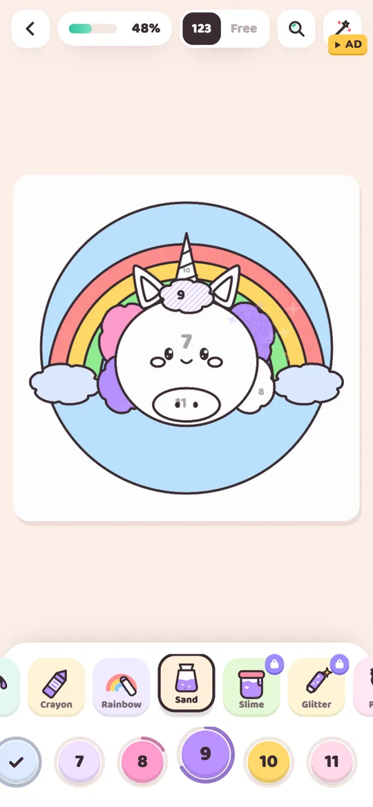
A rainbow picture is the color wheel stretched into an arc, which is why rainbows are a great place to practise.
Value: light and dark do most of the work
Value means how light or dark a color is. It sounds boring, but it is the idea that most often fixes a muddy picture.
Here is a quick test. Imagine your finished picture in black and white. If two shapes that touch turn into the same gray, they will blur together, even if one is green and one is red. If they turn into a light gray and a dark gray, the shapes stay clear.
So when two areas sit next to each other, make one lighter and one darker. A pale yellow background behind a brown basket works because the values are far apart. A mid-blue sky behind a mid-green tree can look flat because the values match.
Brightness: one loud color, many quiet ones
The second idea is brightness, which artists call saturation. A bright color is pure and strong, like a fire truck red. A soft color is calmer and a little grayed or pale, like dusty rose or sage green.
Bright colors pull the eye. That is useful, but only if there are not too many of them. A picture where everything is bright has no place for the eye to rest.
A simple rule: give the brightest color to the most important part and keep most of the picture softer. A bright pink bow on a pale bunny looks like the focus. Ten bright colors on the same bunny look like confetti.
This is also why pastels work so well on cute pictures. They are soft by nature, so one stronger accent stands out. Our pastel color palettes show this idea in six ready-made combinations.
Temperature: warm and cool colors
The last idea is temperature. Reds, oranges and yellows feel warm, like sunshine or a cozy kitchen. Blues, greens and purples feel cool, like water, shade or night.
Warm colors seem to come forward, and cool colors seem to sit back. You can use that to give a flat page a little depth: warm colors on the main character, cooler colors in the background.
The best pictures usually mix both. A mostly warm picture with one cool touch looks balanced, and the same is true the other way round. In the dumpling picture at the top of this page, the big yellow circle and peach dumplings are warm, and the small blue clouds add a cool contrast that keeps the yellow from feeling heavy.
Space pictures flip this around: almost everything is cool and dark, with a few warm sparks. Our galaxy color palette ideas show how that works in practice.
How to plan colors for any coloring page
Put the four ideas together and you get a short routine. It takes about a minute before you start.
- Choose the mood. Warm and cozy, cool and calm, or bright and playful? This tells you which side of the color wheel to lean on.
- Pick three to five colors. Choose most of them close together on the wheel, then add one from across the wheel as a contrast.
- Spread the values. Make sure you have at least one light, one medium and one dark color, so touching shapes can stay apart.
- Pick one star color. Decide which detail is the focus, such as eyes, a bow or a cherry, and give it your brightest shade.
- Color big areas first. Fill the background and large shapes with your quieter colors, then add the star color last on the small details.
When you finish, step back. If the picture looks flat, darken one area. If it looks busy, swap one bright color for a softer one.
Trying it in Colour Cozy
Colour Cozy has two ways to color, and color theory helps in both. In color by number, the colors are chosen for you, so it is a nice way to notice how light, dark, warm and cool shades are combined on each picture. Gentle hints show you when a color does not match the number.
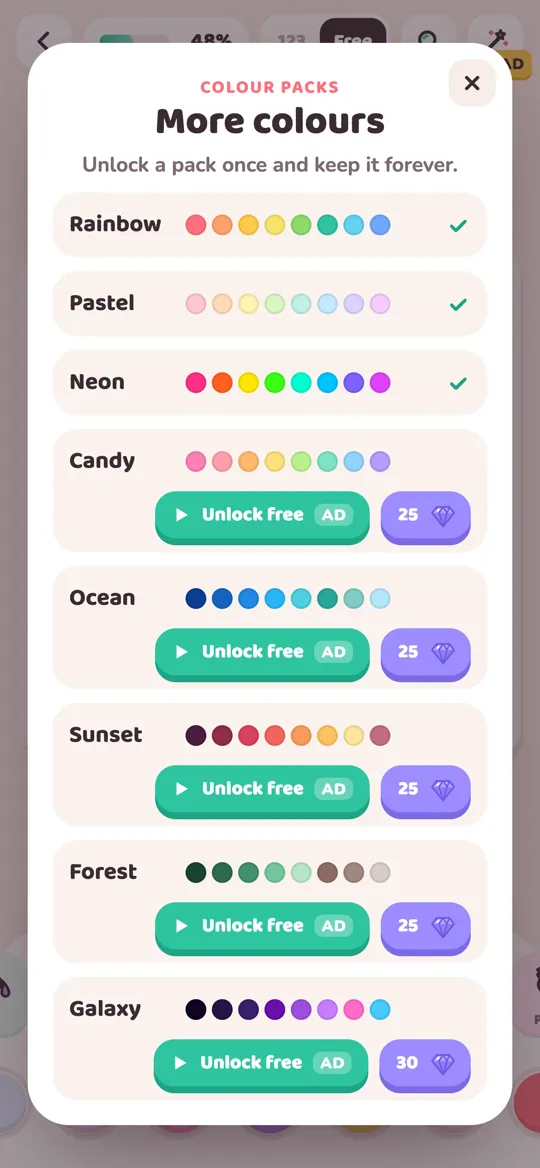
In free mode, you choose every color yourself, so the five-step plan above is yours to try. The Rainbow pack is free from the start. Other packs, like Pastel, Ocean, Sunset, Forest and Galaxy, are ready-made palettes that each unlock once with an optional video or gems and stay unlocked.
If you are not sure which mode suits you, our comparison of color by number and free coloring explains both. And once you are happy with your colors, the ombre and gradient guide shows a soft way to add depth to big areas.
Common color mistakes and quick fixes
- Everything is the same value. Shapes melt together. Make one neighbor lighter or darker.
- Too many bright colors. The picture feels noisy. Keep one star color and soften the rest.
- All warm or all cool. The picture feels heavy or cold. Add one small touch from the other side.
- A brand new color on every shape. Repeat your colors. Using the same blue in two or three places ties the picture together.
FAQ
What is color theory in simple words?
Color theory is a set of simple ideas about how colors look together. For coloring pages, the most useful parts are the color wheel, light and dark values, bright and soft colors, and warm and cool colors.
How many colors should I use on one coloring page?
Three to five main colors is a good start, plus white and the dark outlines. Fewer colors used in more places usually look more planned than many colors used once each.
What are the three primary colors?
In paint and colored pencils, the primary colors are red, yellow and blue. Mixing two of them gives the secondary colors: orange, green and purple.
Why does my coloring look muddy?
Usually because touching areas have the same lightness, or because there are too many strong colors next to each other. Make neighbors lighter or darker than each other and keep only one very bright color.
Can kids learn color theory from coloring?
Yes, in a playful way. Ask simple questions while they color, like which colors feel warm, which color should be the star, or what happens if the sky is pink instead of blue. Choosing an app for a child? Our parent checklist for coloring apps covers ads, purchases and privacy.