 Colour Cozy
6 pastel color palettes for cute coloring pages
Soft colors are the heart of kawaii art, but they can look washed out. Here are six combinations that stay gentle and still pop.
In this guide
The best pastel palettes pick three to five soft shades from different color families, such as blush pink, butter yellow and mint, then add one slightly deeper accent so the picture has a focus. Keep the lightest shade for large areas, use the brightest for small details and leave a little white so the pastels can breathe.
Pastels are the colors of kawaii art: blush pink cheeks, mint ice cream, lavender clouds. They feel calm and friendly, which is why they suit cute coloring pages so well.
They also have a weakness. Put five pale colors next to each other and the picture can look faded, like a photo left in the sun. The fix is not to avoid pastels, it is to combine them on purpose.
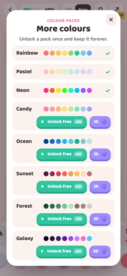
Below are six pastel color palettes that work on cute pictures, with the shades in each one and where to use them. You can use them with colored pencils on paper or in a coloring app. In Colour Cozy, the Pastel pack has ten soft shades, from blush pink and peach to mint, baby blue, lavender and a warm beige.
How to make pastels look good
Three simple rules make almost any pastel palette work.
- Mix color families. Pick shades from different families, like a pink, a yellow and a green, instead of three pinks.
- Add one deeper accent. A slightly stronger color for small details, like eyes, a bow or a cherry, gives the eye somewhere to land.
- Big areas light, small areas bright. Use your palest shade for the largest areas, like the background, and save the strongest shade for the smallest ones.
Six pastel color palettes
1. Strawberry milk
Shades: blush pink, cream, pale peach and a touch of soft red. Use it for: cakes, cupcakes, bunnies and anything that should look sweet. Tip: put the soft red only on small details, like a strawberry or a heart. Everything else stays pale.
2. Mint ice cream
Shades: mint green, butter yellow, pale aqua and white. Use it for: ice cream, frogs, spring scenes and plants. Tip: mint and yellow look fresh together. Leave white highlights on round shapes to make them look shiny.
3. Lavender dream
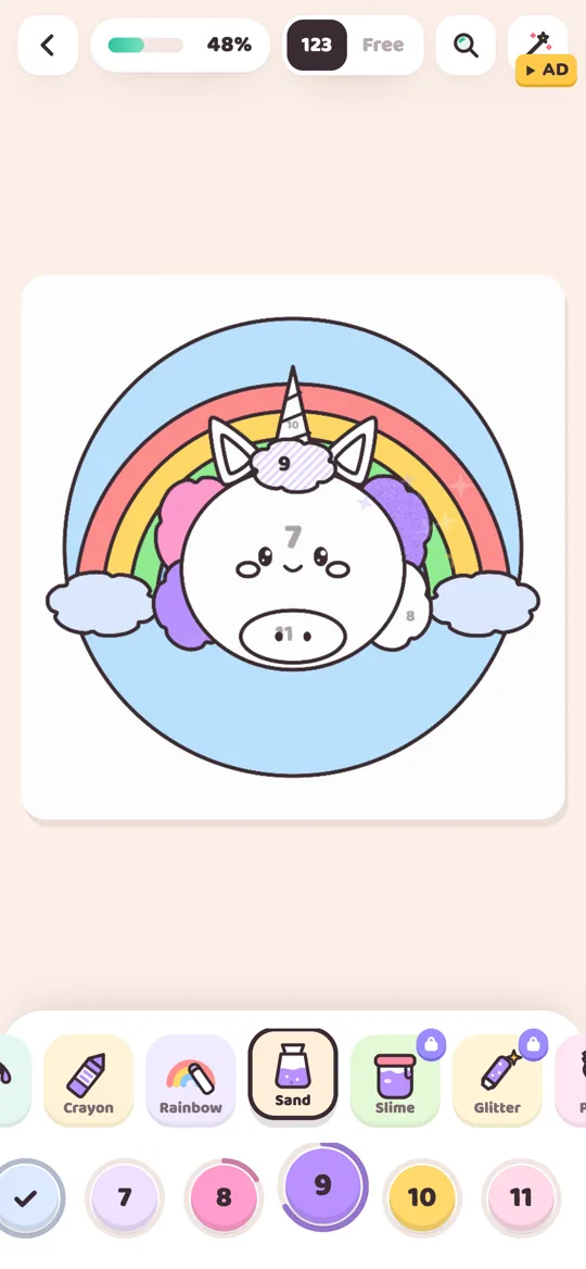
Shades: lavender, lilac, baby blue and pale pink. Use it for: unicorns, clouds, night skies and sleepy characters. Tip: this palette is all cool tones, so add one warm touch, like a peach blush on a cheek, to keep it from feeling cold.
4. Peach sunrise
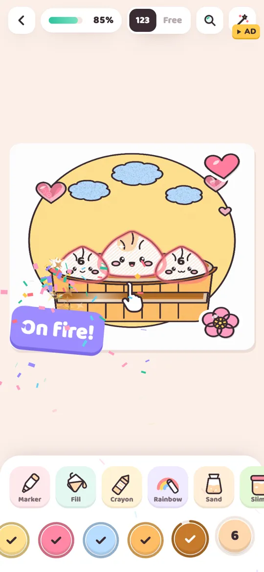
Shades: pale peach, butter yellow, blush pink and a light warm beige. Use it for: food pictures, bread, dumplings and cozy indoor scenes. Tip: warm palettes can blend together. Outline areas in a slightly darker peach to keep shapes clear.
5. Seaside pastel
Shades: baby blue, pale aqua, sand beige and white. Use it for: whales, boats, beaches and bubbles. Tip: use a gradient from aqua at the bottom to baby blue at the top to suggest water depth.
6. Rainbow pastel
Shades: one pale step of every rainbow color: pink, peach, yellow, mint, blue and lilac. Use it for: rainbows, unicorn manes, party scenes and patterns. Tip: keep the order of the rainbow. Pastel rainbows look magical when the colors flow, and random when they jump.
Coloring a picture in pastel, step by step
Here is a simple order that works for any cute picture.
- Pick your palette before you start, three to five shades plus one accent.
- Color the biggest area first with your palest shade. Usually that is the background or the main body.
- Fill the medium areas with your middle shades, keeping neighbors in different color families.
- Add the accent on the smallest details: eyes, cheeks, a bow, a cherry.
- Step back and compare. If it looks flat, deepen one area slightly. If it looks busy, swap one color for white.
In Colour Cozy you can do this in free mode, where you choose every color yourself. Prefer to be guided? Read our comparison of color by number and free coloring to see which suits you.
Pastel tools that look extra soft
Some tools suit pastels better than others:
- Crayon has a real paper grain that makes pastels look hand-drawn.
- Ombre blends two shades, which is perfect for skies and water.
- Sand gives pastel colors a soft, grainy texture that looks lovely on beaches and desserts.
- Glitter on one small pastel area, like a unicorn horn, adds sparkle without breaking the calm look.
Common pastel mistakes
- All shades from one family. Five pinks look like one big pink blob. Mix families.
- No accent at all. Without one deeper color the picture has no focus.
- Pastel everything, including outlines. Keep line art dark so the soft shapes stay readable.
- Too many neighbors with the same brightness. If two touching areas are equally pale, make one a step lighter or darker.
If you color to unwind at the end of the day, pastels are a lovely fit. Our guide to what ASMR coloring is explains why the sounds and textures make it feel so cozy.
FAQ
What colors are considered pastel?
Pastels are soft, light versions of colors, made by mixing a color with plenty of white. Common pastels include blush pink, peach, butter yellow, mint green, baby blue, lavender and lilac.
How do I stop pastel coloring from looking flat?
Mix shades from different color families, add one slightly deeper accent for small details and keep the outlines dark. Using a gradient or ombre on large areas also adds depth.
What pictures look best in pastel colors?
Cute subjects like desserts, bunnies, unicorns, clouds and sleepy animals suit pastels best. Bold subjects like monster trucks can look fun in pastel too, as a playful twist.
How do I unlock the Pastel pack in Colour Cozy?
Open the colour packs sheet and choose Pastel. You can unlock it once by watching an optional video or with gems, and it stays unlocked. The Rainbow pack is free from the start.